Branded | Hunter, Gatherer, & Treasure Finder, The Story of Kalen Mehlman Owner of Kalen's Place
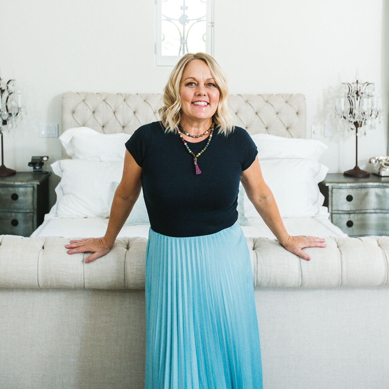
Think of that one friend whose style seems so effortless, each part of her outfit is working with the other. She's laid-back, easy-going, and you feel like you've known her your whole life even though you just met her. There's something about her that is out of the ordinary. Is it that her earrings match perfectly with her blush suede shoes? Or is it that her smile reminds you of someone you know, friendly, warm, and inviting.
Kalen is a conduit for artistic expression. She describes how creativity has “ebbed and flowed in all directions” throughout the years, showing up in different mediums and manifesting most through her interior design work.
The radiant soul I'm describing is Kalen Mehlman, the creative visionary behind Kalen's Place. And if you happen to have the chance to meet Kalen for yourself, you'll discover that her aura shines as boldly and brightly as the rooms she's known for decorating.
I had only called Arizona my home for a few days before meeting Kalen. But the trendy taco spot on the Camelback strip that she and her husband John own The Beach House was eye-catching. It was packed with playful design and had me daydreaming of Baja inspired salsas and California beaches every time I passed their iconic 1960's Volkswagen bus.
Meeting her and John over marinated cactus tacos and marketing banter, we realized an opportunity to work together. You can check out my post here to read more about how I worked with Kalen and John to elevate their neighborhood spot where funky style, flavorful food, and hospitality like home intersect.
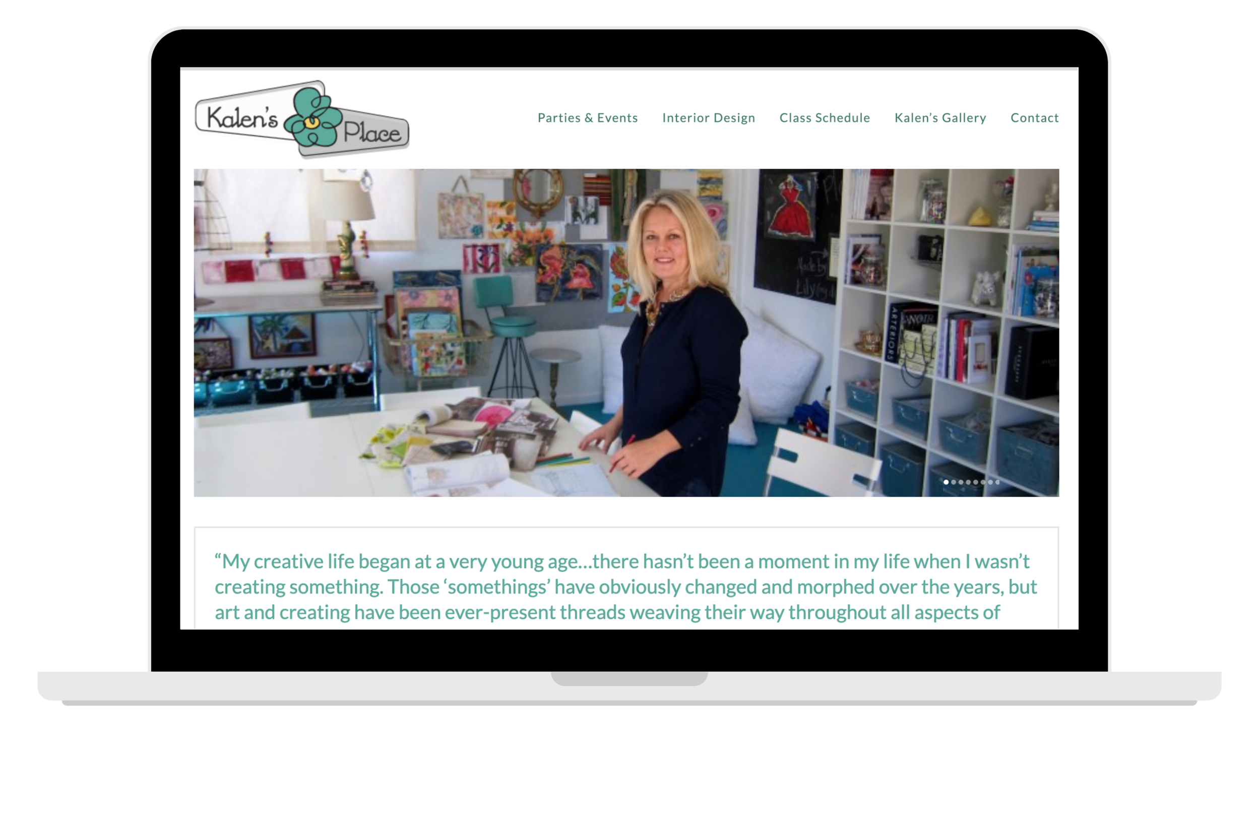
After working with Kalen for The Beach House, we shifted our attention to her personal brand. Beyond satisfied with the new design for the restaurant's website, Kalen asked if I could help revamp her own web presence and translate her skill and charisma through a new lens. The original website she had designed was a little outdated, a little all over the place, and a bit too kitschy. And while Kalen can blend old and new and bold colors and patterns, she's always able to do it in a way that's effortless and makes sense, and that's exactly what I wanted to achieve for her new website. The challenge was designing something that showcased Kalen's vibrant creativity and fully represented her unique style in a way that looked as seamless as the rooms she creates for her clientele.
Kalen’s Website Before
To elevate her brand presence, it was important to translate her creativity and professionalism to her website.
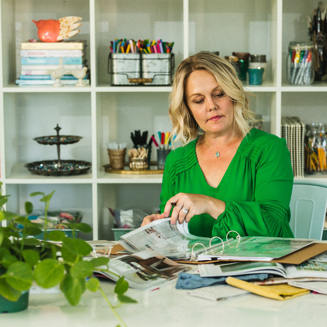
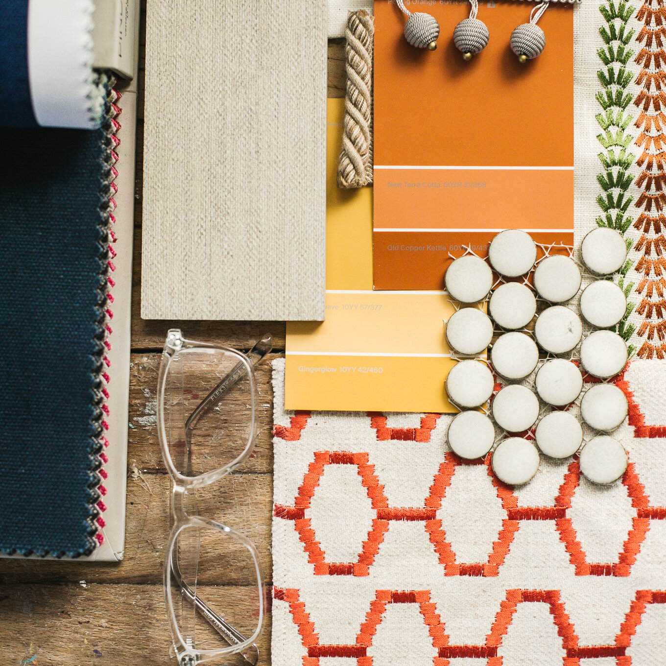
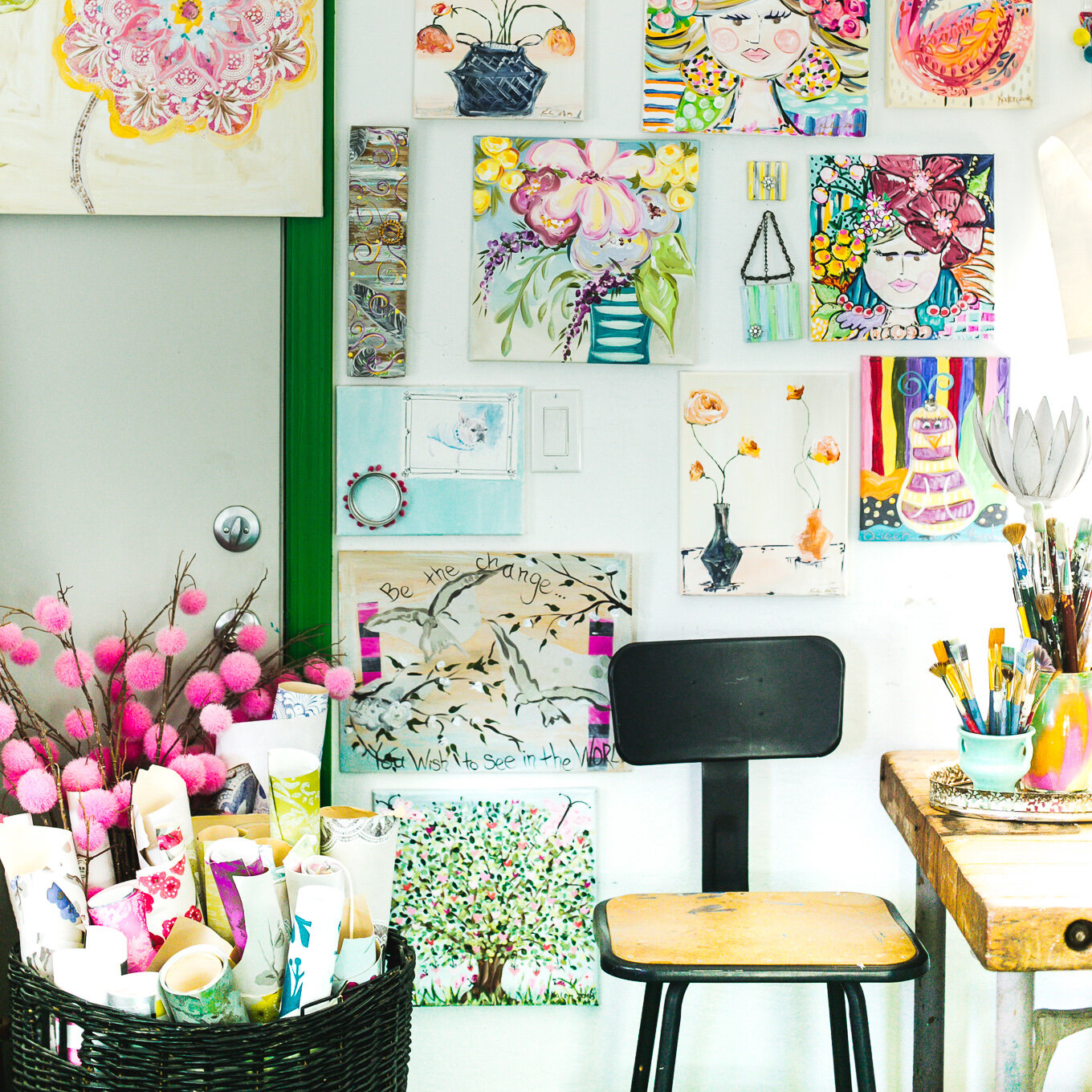
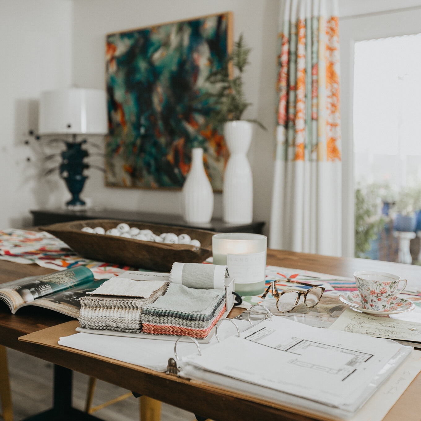
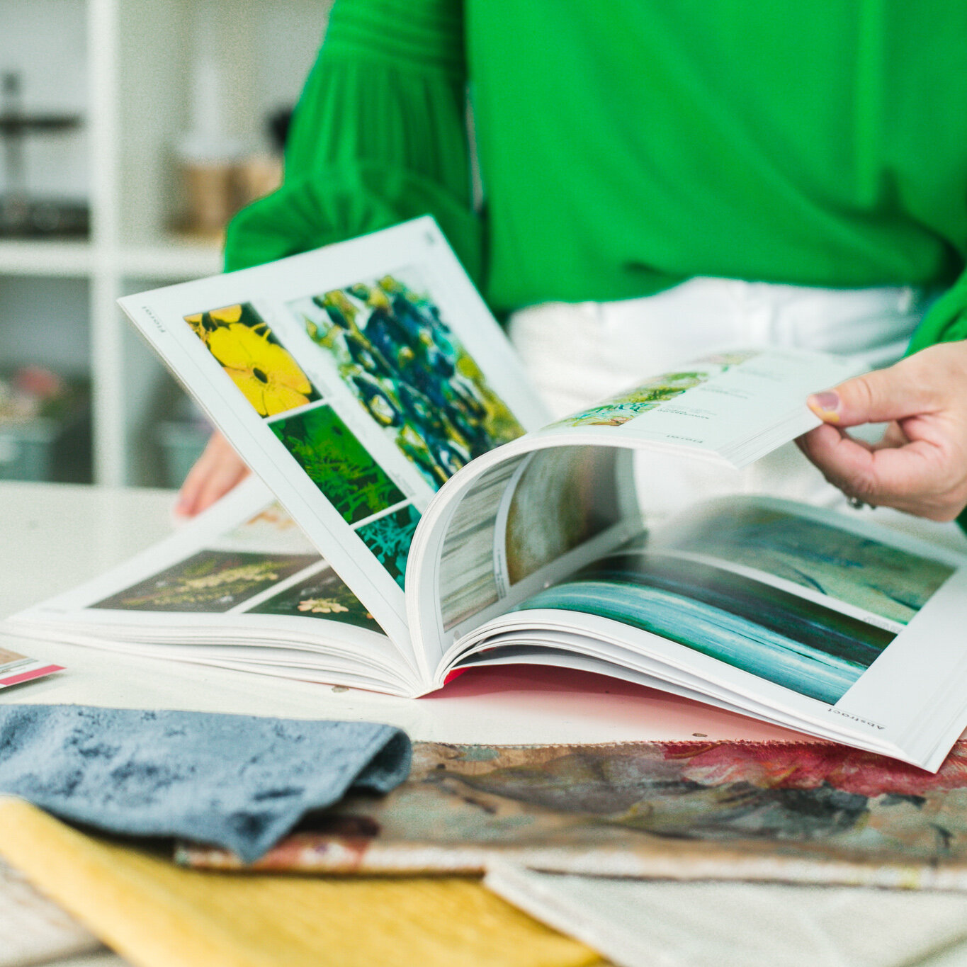
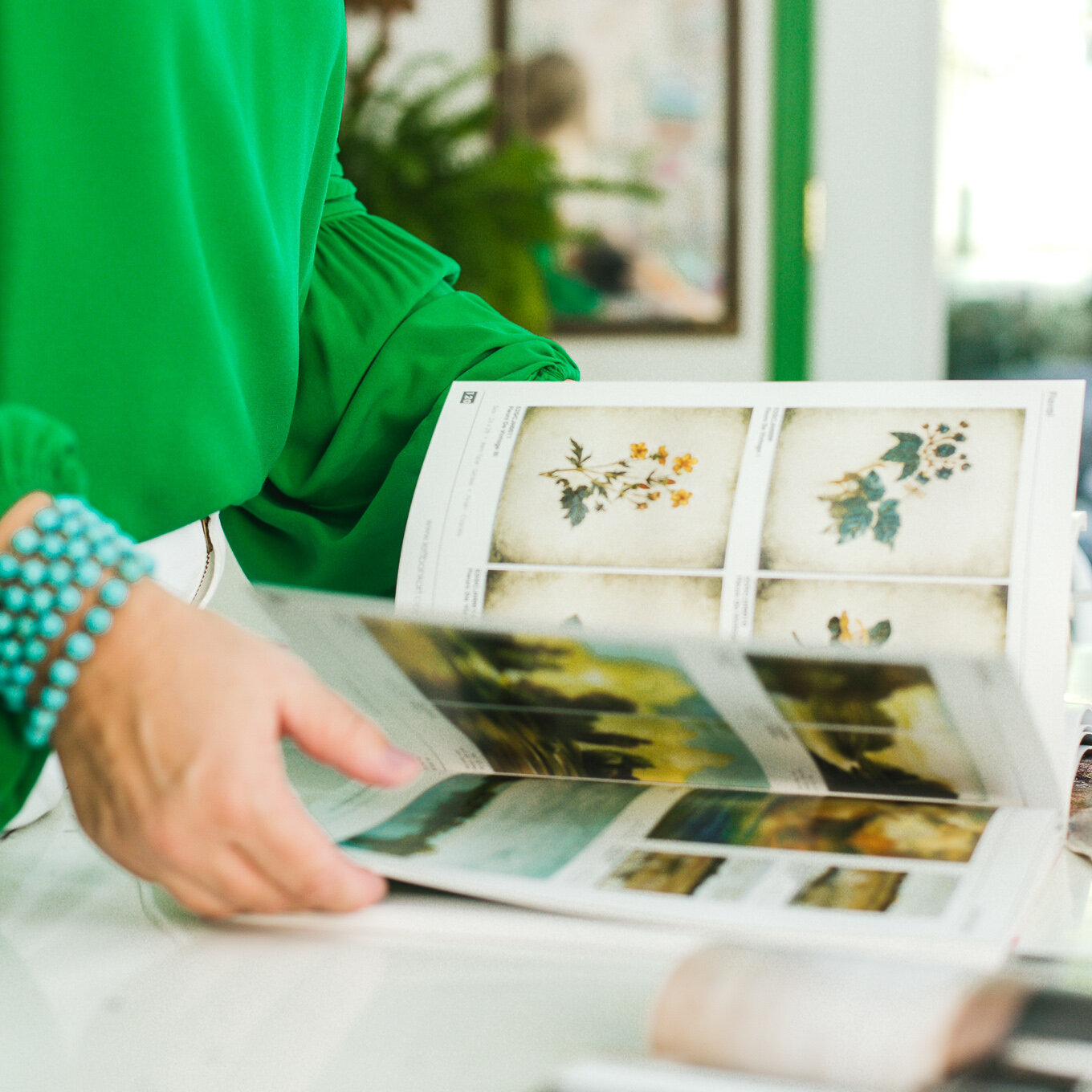
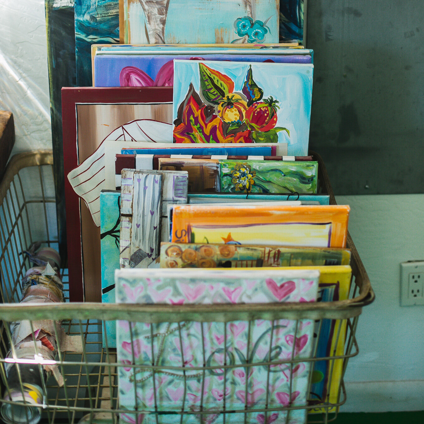
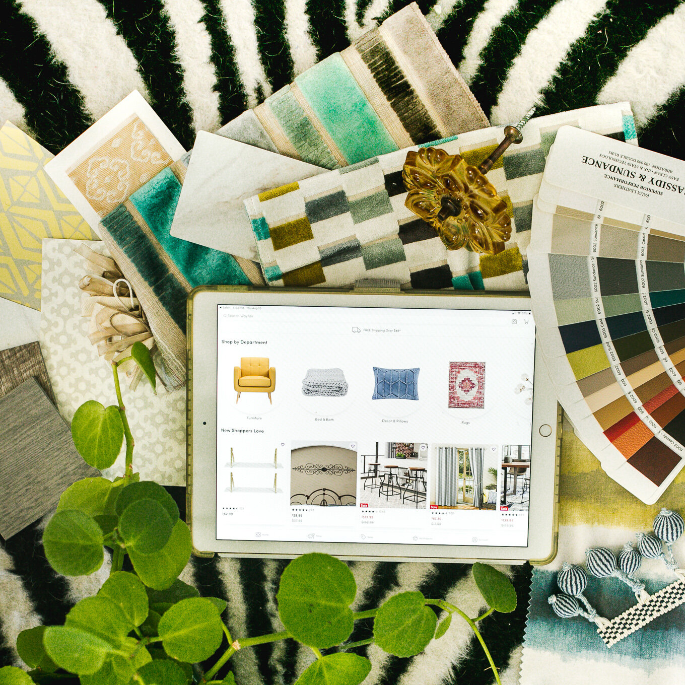
Months leading up to her full day website photoshoot, her studio welcomed me for a handful of conversations focused on highlighting all of her work's whimsy and wonder. Flipping through color swatches, all of which I usually shy away from, I began to get a better glimpse into the personality that is Kalen's Place. A part of me identified with her process for creating because whether it's a room or a canvas that she's painting, she works to add in multiple layers in any given scene and pays attention to even the smallest details.
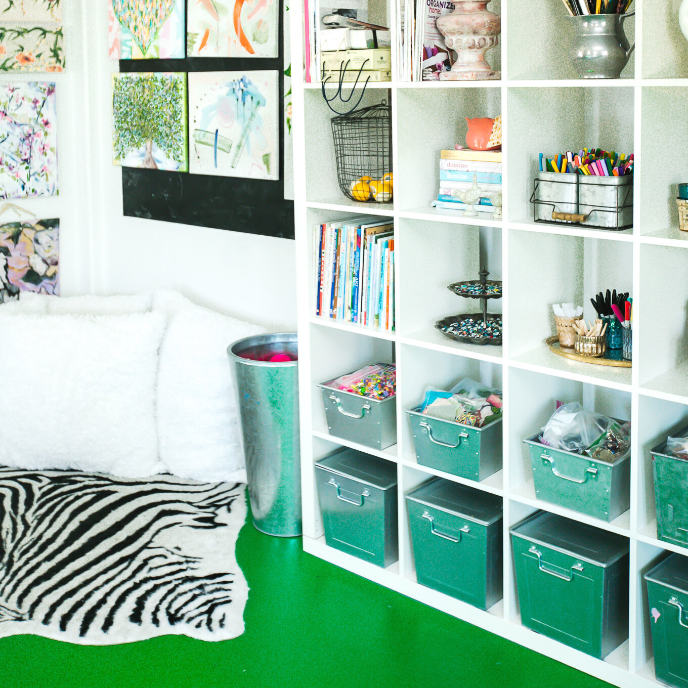
In that converted garage with freshly painted grasshopper green floors from Sherwin Williams, Kalen wove together her brand story for me, and I knew her brand photography needed to have the same depth. It needed to tell a story of a day-in-the-life of her business and visually feel like something you could run your hands through and imagine the feeling of the texture of each of the fabrics she weaves into her design concepts.
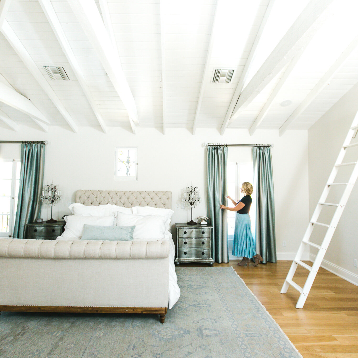
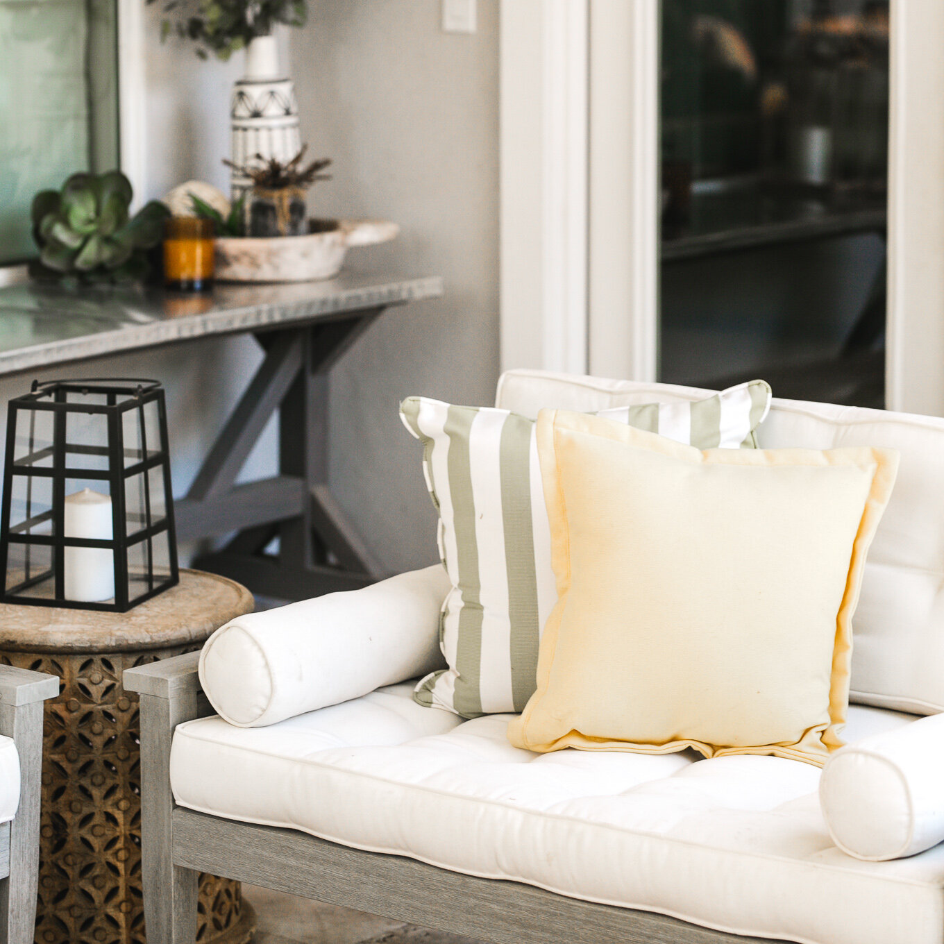
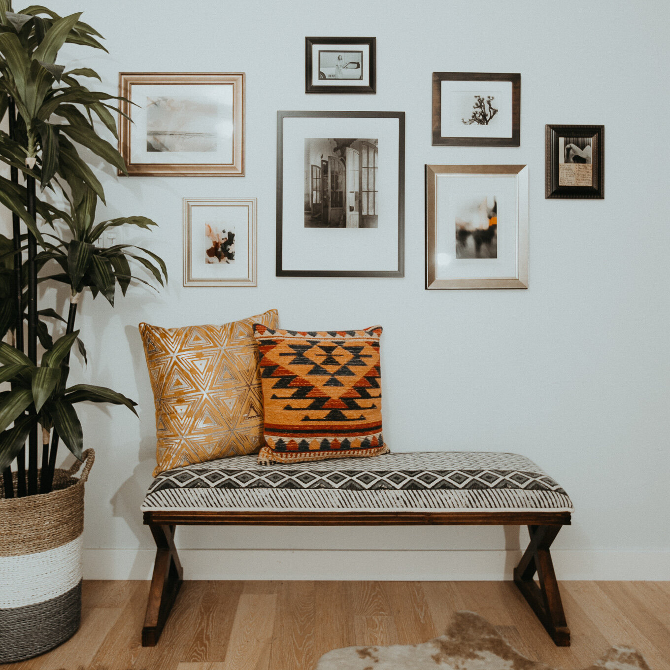
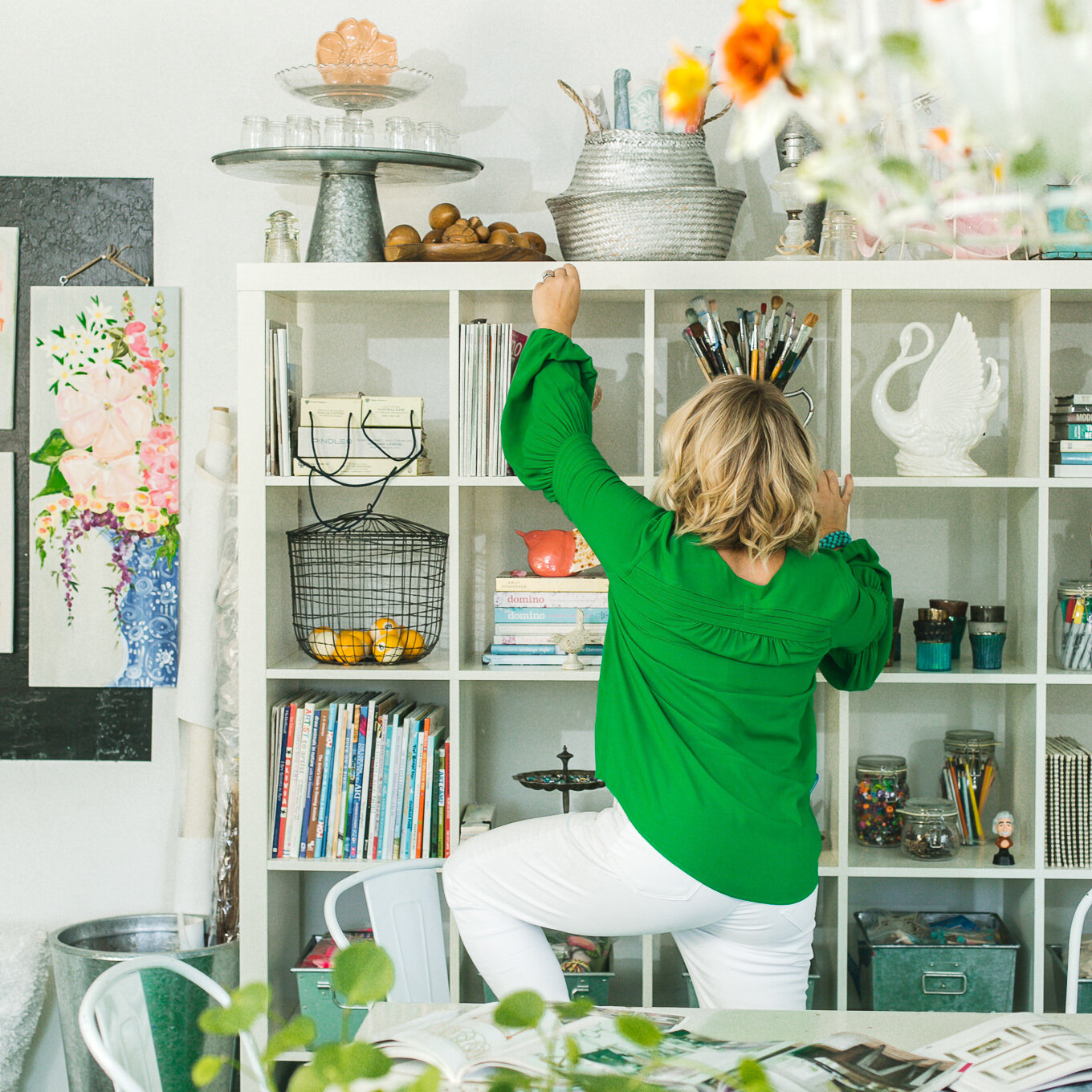
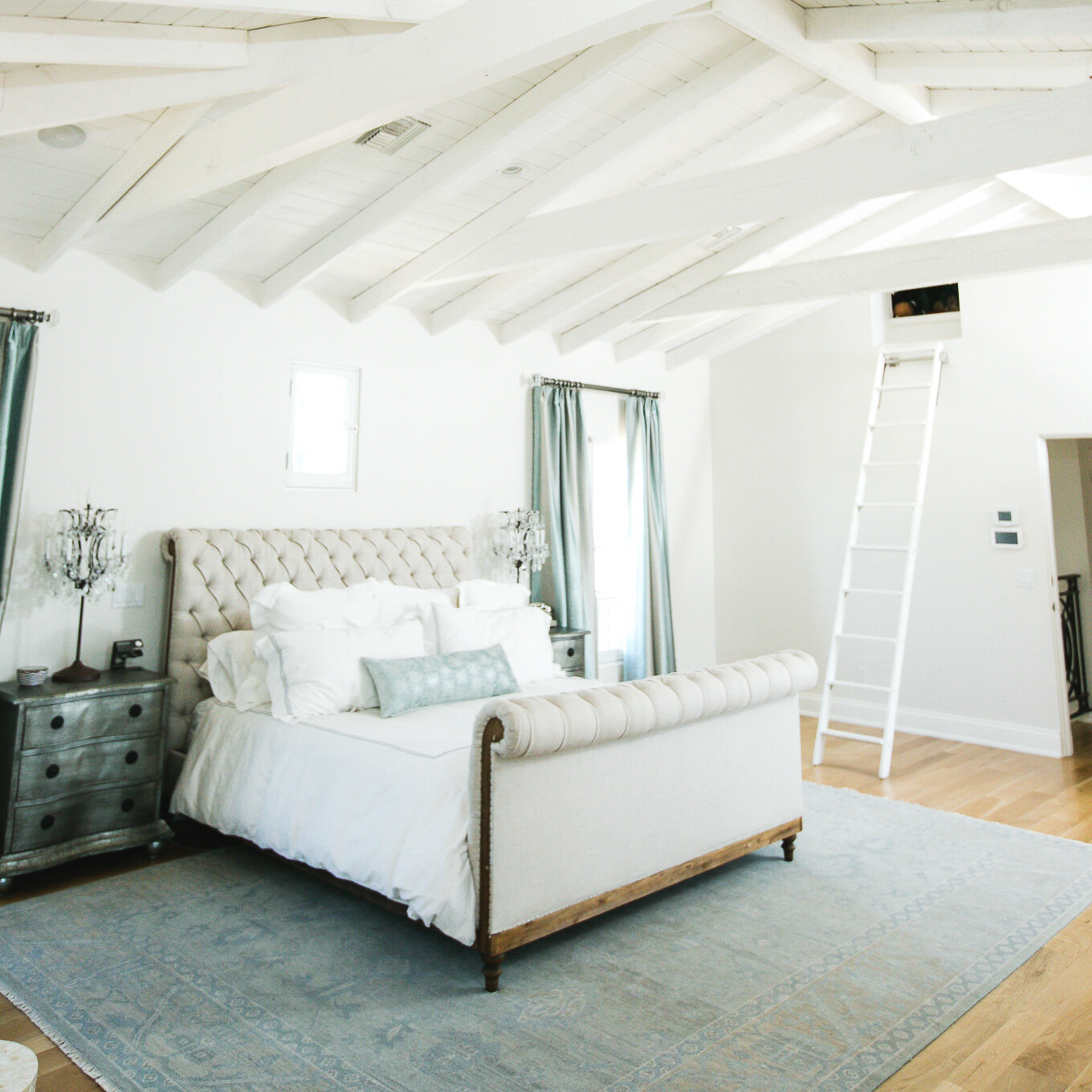
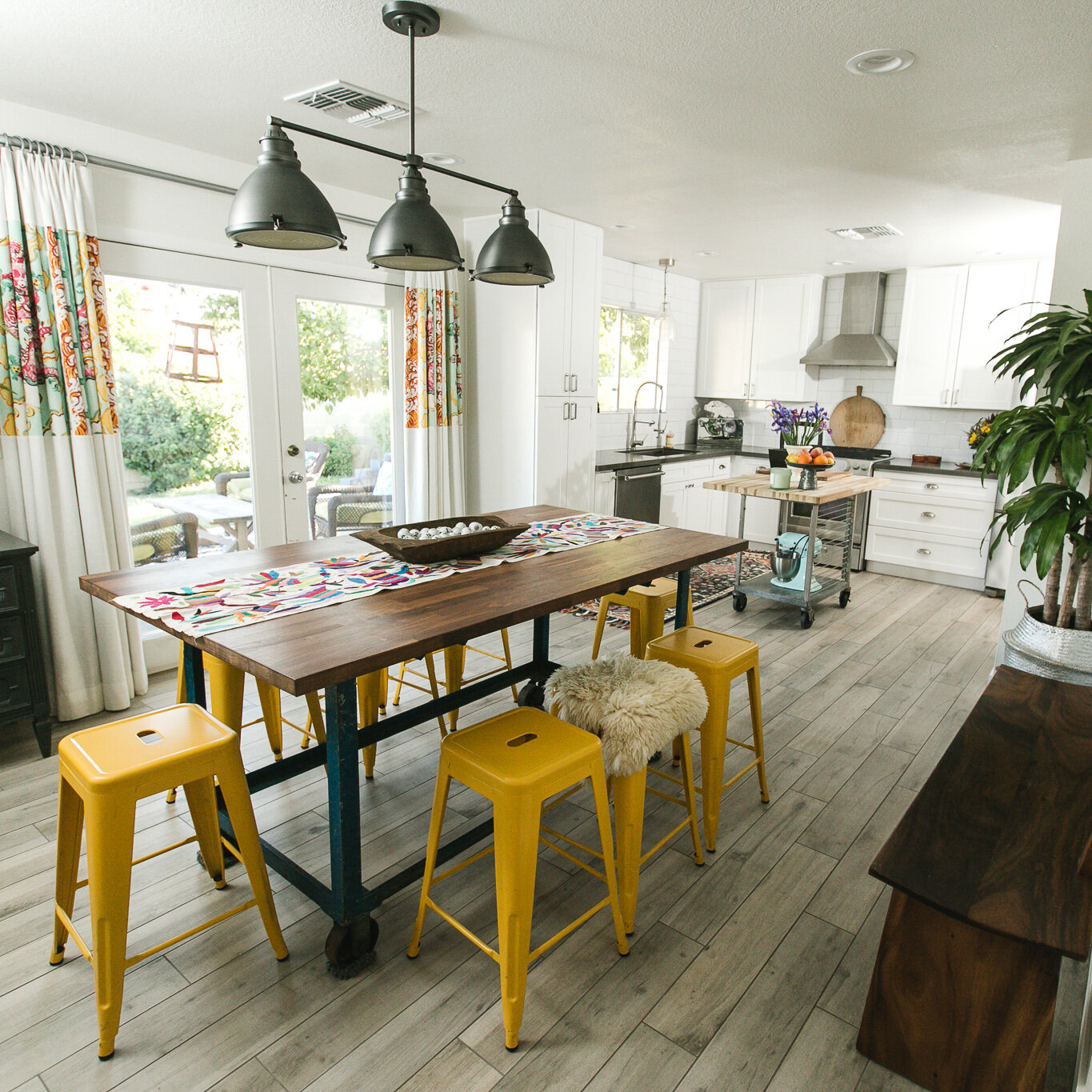
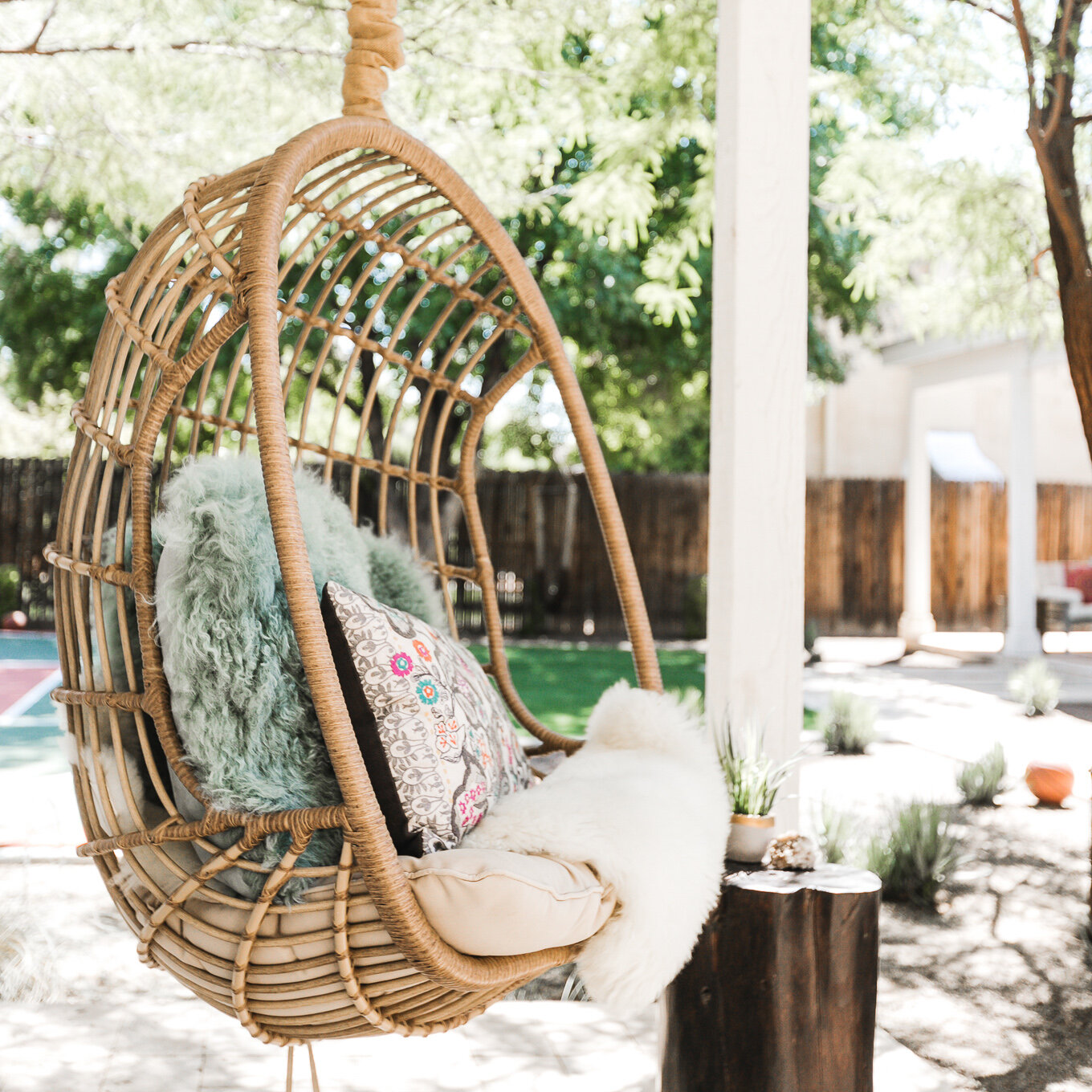
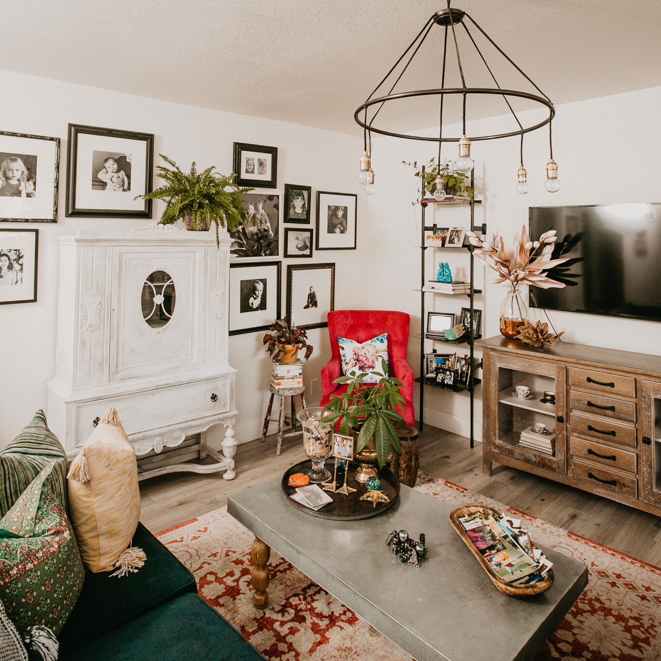
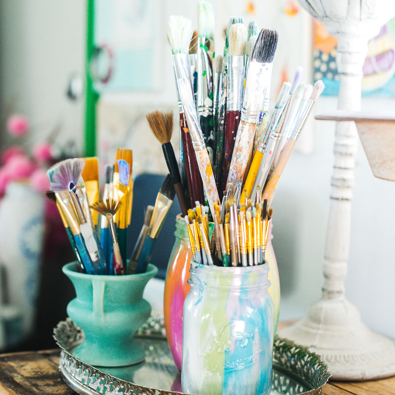
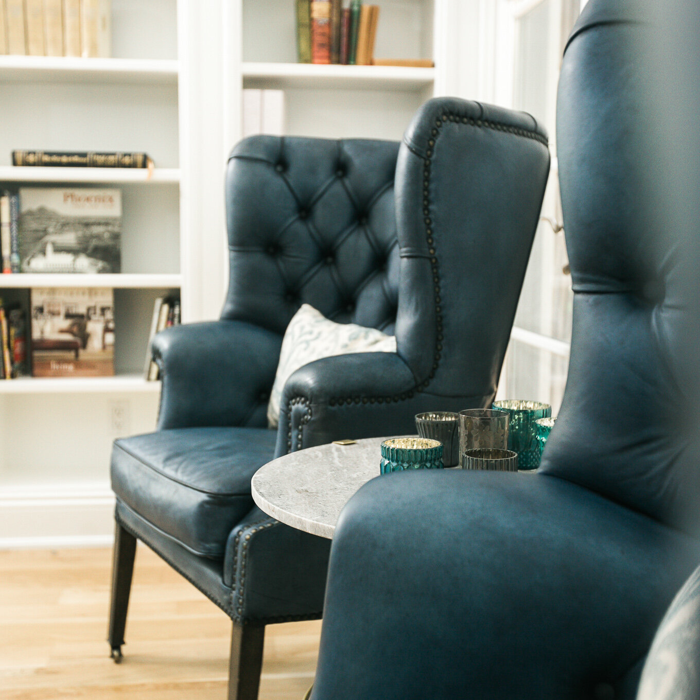
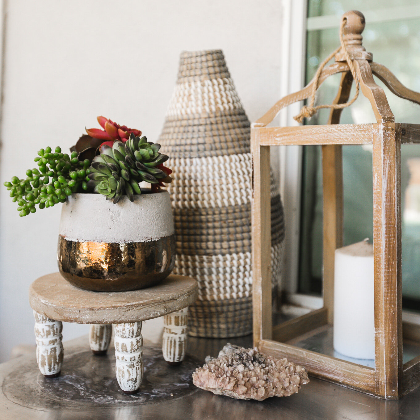
Light and airy photos, sprinkled with color, were a must. Kalen and I spent a full day shooting at her favorite design spaces, her colorful home studio, and her favorite thrift store, The Reclaimed Nest.
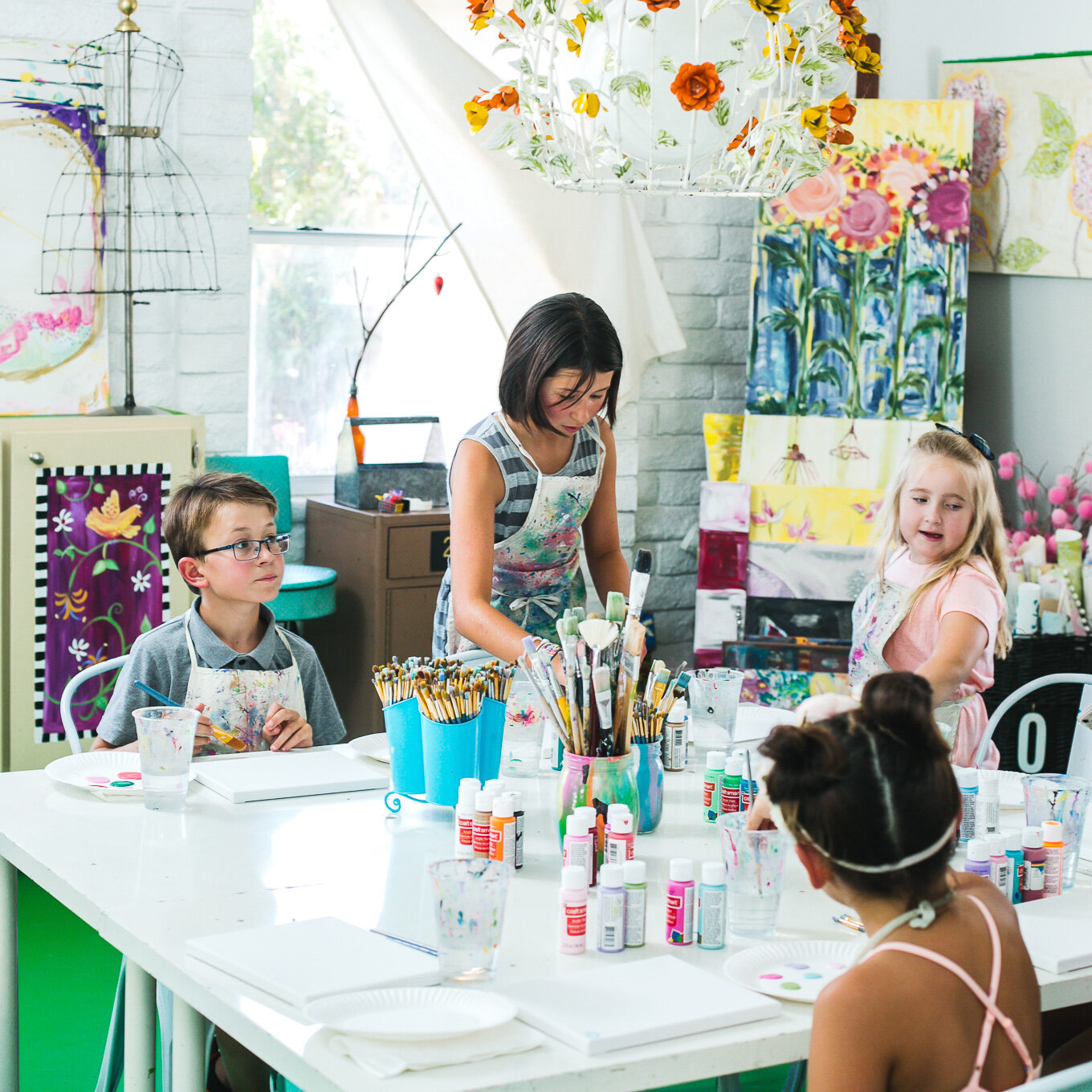
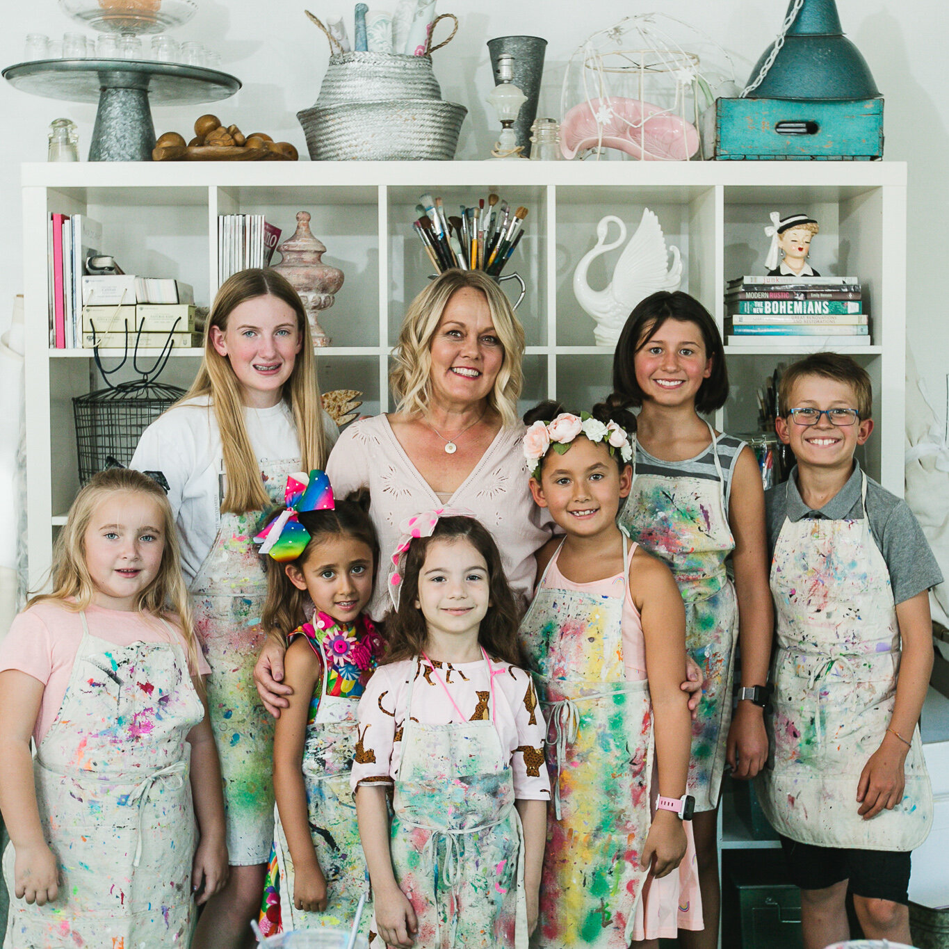
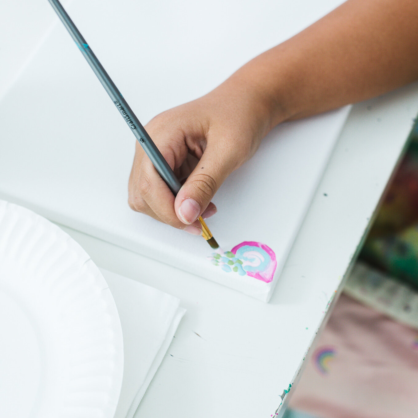
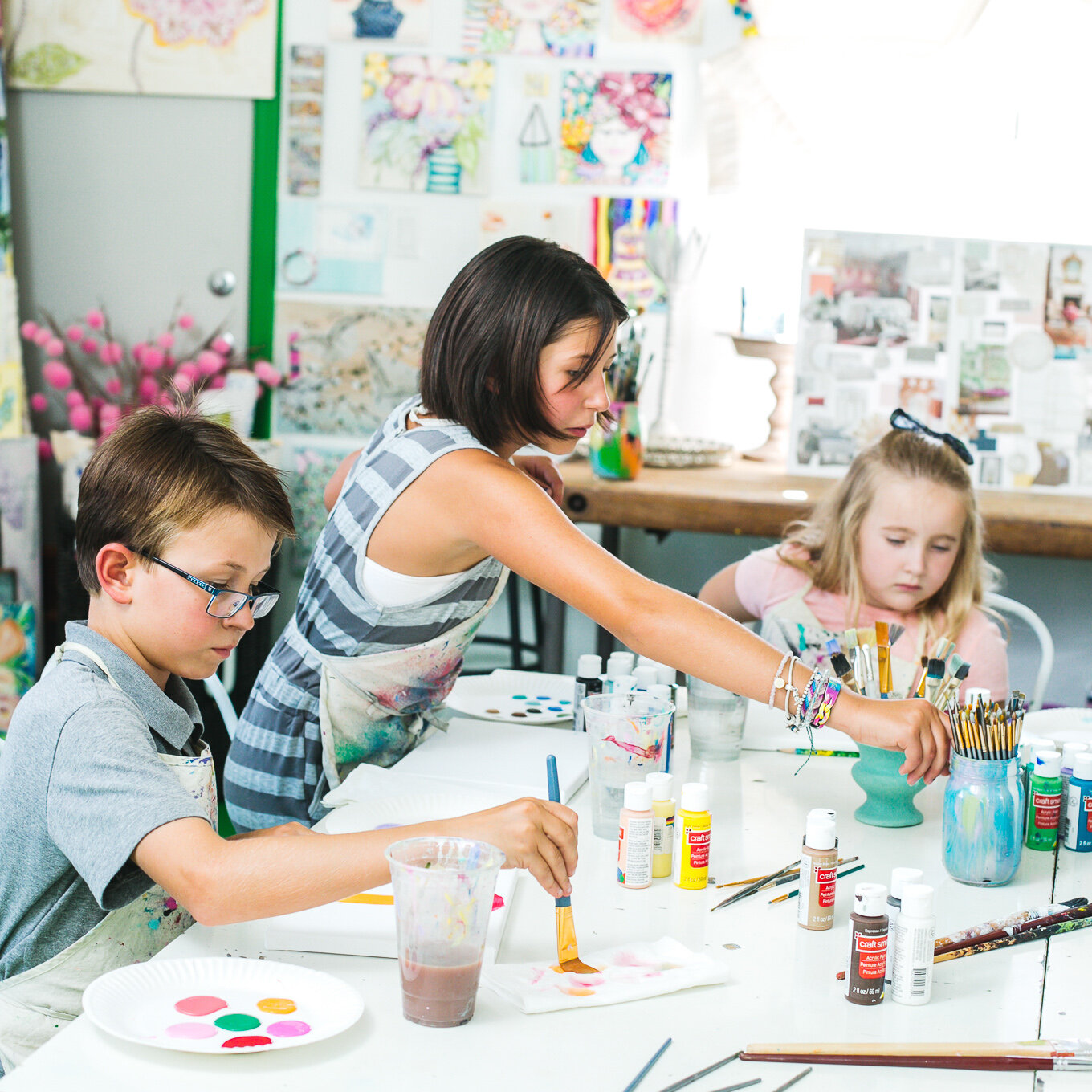
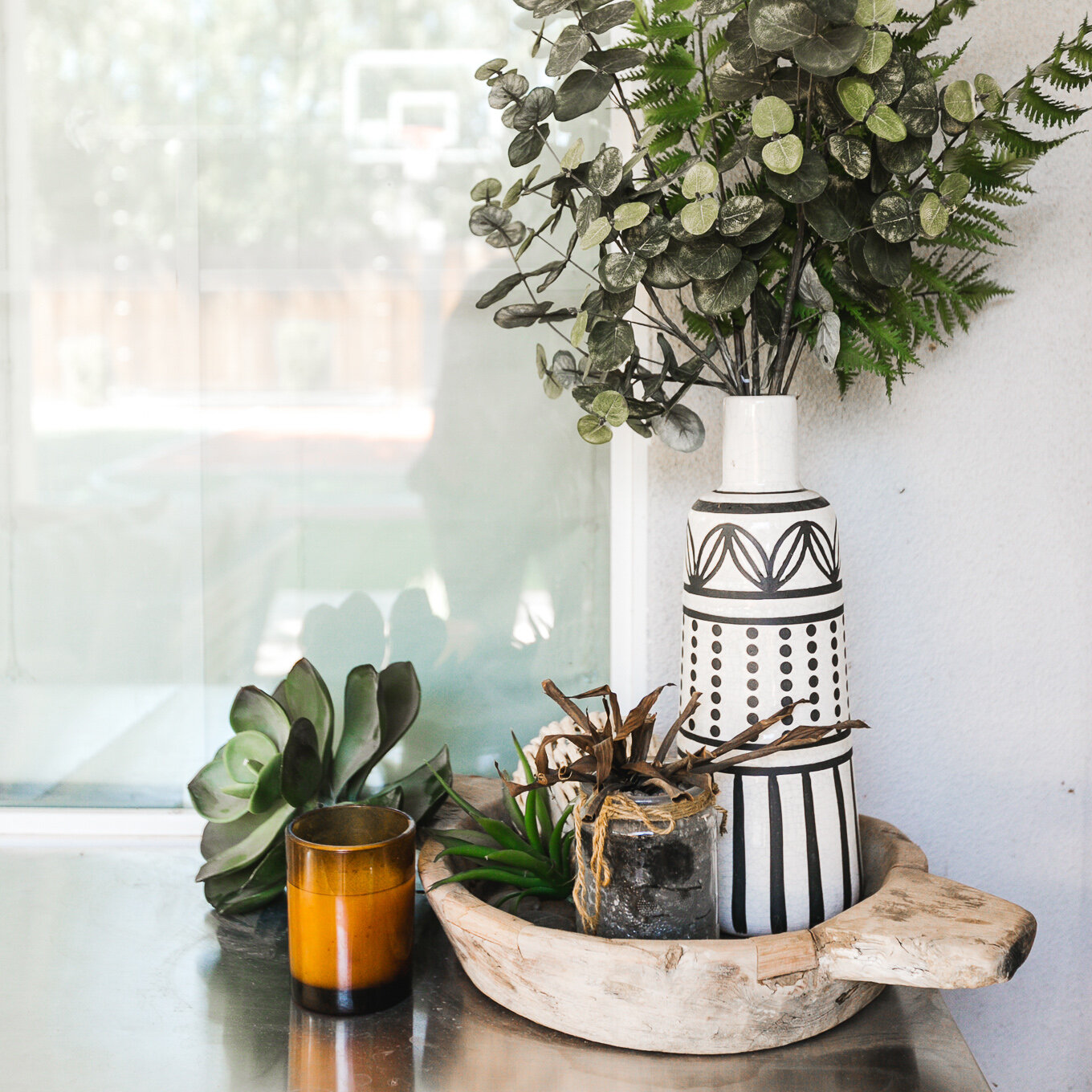
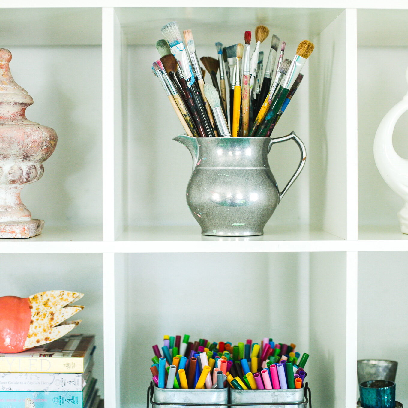
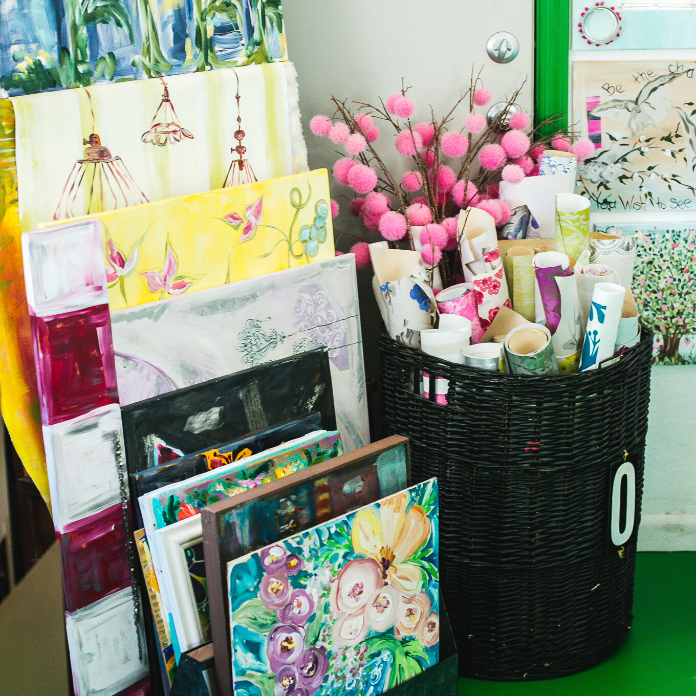
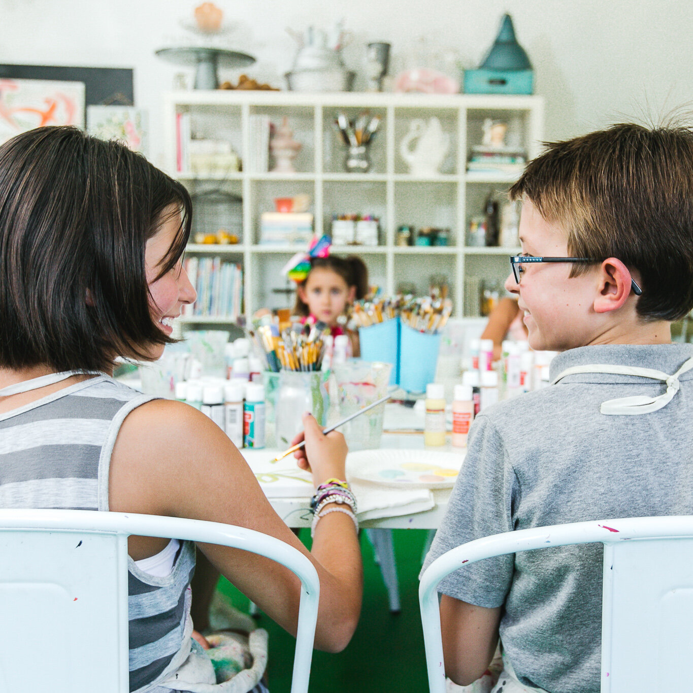
Each of the spaces we shot in housed a plethora of skill, technique, and style, and I made sure to capture the decorated nooks and corners of each room. Towards the end of our shoot together, Kalen invited her summer art students into her studio so we could showcase her love for teaching. An advocate for that inner artistic spirit that we all have hidden away behind work and seriousness, I could see how the process of merely creating brings so much joy to Kalen. Catching a few moments of childhood imagination on camera brought me back to simpler times when creating was simply a soul expression. It reminded me that art, design, and even photography are less about the final product and more about falling in love with the process. Something both Kalen and I have done in our respected industries.
When the photoshoot ended, the next phase of work began—transforming the art again through another medium, from concept to photo, to web design, and finally copy. I hand-selected organic and loose assets to layer within pages of her website. Staying focused on the client experience, Kalen's uniqueness, and the Squarespace website's overall design layout, I optimized the website to tell Kalen's story.
The custom website structure I created for Kalen's Place is simple and timeless, reflecting how Kalen works with her clients. It's intuitive and exploratory, but the aesthetic makes it unique and speaks to her personality and story. It's a night and day difference from her previous site. And the process of creating it for her was every bit as enjoyable as seeing the final product.
Her ability to pair unique pieces to balance and contrast a space still boggles me even after I’ve seen her process first hand.
From a very young age, she was a real treasure “hunter and gatherer.”
Be it pretty rocks and shells found along the lakeside, to softly colored pieces of worn glass, bits of colorful fabric for doll clothes, scarves that doubled as costumes for plays, most of her “findings” were strongly considered and collected accordingly. Later, it became unique beads for jewelry-making, vintage pieces that were updated and re-purposed, old dress patterns used in paintings, 50s table cloths made into pillows, re-upholstered chairs for a dining table. The desire to create is in Kalen’s soul, and it truly is who she is.


